Have you ever walked into an office and noticed that their business card looks like it belongs to a totally different company than their banner? Maybe their logo is squished, the colors are off, or the fonts just don’t match. If you’ve seen it, you know how confusing (and slightly disappointing) it can be. That’s exactly what logo inconsistency looks like, and trust me, it’s not a good look for any brand. That is why the importance of employing prints service firm like us cannot be overemphasized.
10 Unique Souvenir and Gift Ideas in Nigeria (With Photos)
You don’t want your brand to give off mixed signals, right? That’s why keeping your logo consistent across all your prints service materials—whether it’s flyers, brochures, or giant roll-up banners—is super important. It keeps your business looking professional, trustworthy, and easy to recognize, no matter where people see you.
Let’s dive into why logo consistency really matters, and how you can keep everything looking clean and on-brand without losing your mind in the process. If you are looking for decent branded gift item checkout our EliteCarrier™
Prints Service-First Impressions Matter
Whether someone’s glancing at your banner at a conference or flipping through your brochure at a coffee shop, you want them to instantly recognize your brand. A consistent logo helps make that happen. When your logo looks the same on every printed item, you build trust and familiarity with your audience.
Think of your logo like your face—if it kept changing every time someone saw you, they’d probably stop trusting who you are. With a good prints service, you can make sure your logo always looks its best on every platform and material. You don’t want it stretched on one banner, cropped weirdly on a flyer, or showing up in slightly different shades of blue on different materials. That’s not modern—it’s messy.
By keeping your logo’s size, color, spacing, and layout the same across all your prints, you give your brand a polished and dependable image. And honestly, who doesn’t want to look like they’ve got it all together?

Consistency Builds Recognition (and Saves You From Confusion)- Prints Service
When your logo looks the same everywhere, it becomes easier for people to remember you. Let’s say you’ve got a flyer handed out at a seminar, a poster on a wall, and a pop-up banner at an event. If your logo is consistent across all three, someone who’s seen it once will likely spot it again and instantly connect the dots.
But if your logo is in a different style or color every time, it can be confusing. People might think it’s a different company altogether. And that’s a branding disaster waiting to happen.
The best prints service providers understand the importance of this. They’ll work with your brand guidelines to make sure every printed item speaks in one clear, confident voice—your voice. That way, your brand identity stays strong, even when it’s showing up on different formats and sizes.
Use a Brand Guide (Even If It Sounds Boring)
I know, I know—“brand guide” sounds like something only huge corporations care about. But trust me, it’s helpful even if you’re a one-person business. A brand guide is basically your cheat sheet. It tells your prints service provider how to use your logo, what colors to stick to, and what fonts represent your brand.
With a guide in place, you don’t have to start from scratch every time you want to design a brochure or banner. You just hand it off, and the designers do their thing—correctly. That means less time fixing design mistakes and more time focusing on growing your business.
Also, it helps your business look way more professional. When your materials all “match,” people are more likely to take you seriously. And let’s be honest, looking legit never goes out of style.
Keep It Scalable—Because Your Logo Goes Places
Your logo needs to look great whether it’s on a tiny sticker or a giant vinyl backdrop. So make sure it’s designed in a high-resolution or vector format, and always check with your prints service provider before sending in low-quality files.
A blurry or pixelated logo? That’s a quick way to look amateurish. When you keep your logo files clean and scalable, your brand can shine whether it’s on a business card or a billboard. And once again, it helps keep that consistency intact across different print sizes.
Your prints service should be able to help you resize things properly without distorting your logo. Don’t be afraid to ask for a proof or a sample before printing the full batch—better safe than sorry!
Final Thoughts: Keep It Simple, Keep It You
At the end of the day, your logo is the face of your brand. If it’s looking different every time someone sees it, people won’t remember it—or worse, they’ll remember it for the wrong reasons. So make sure your logo shows up looking its best on every flyer, brochure, and banner you produce.
By working with a reliable prints service and sticking to some simple rules, you’ll have a consistent, professional brand that people recognize and trust. And when your branding is on point, your business feels more put together—and a lot more fun to share.
Now go on, give your logo the love and consistency it deserves!
Let’s face it—colors aren’t just pretty decorations. They actually speak to our brains in ways we barely even notice. And when it comes to designing your flyers, brochures, and banners, the colors you choose can either attract or repel potential customers. Sounds dramatic, right? But it’s true. This is where the magic of color psychology comes in.
Whether you’re creating a fresh brochure or designing a banner for your next big event, the right color choices can subtly shape how people feel about your brand. With a good prints service by your side, you can use colors to make people feel comfortable, excited, curious, or even hungry (yes, colors can do that).
Let’s break it down and see how you can use the power of color to your brand’s advantage—without needing a psychology degree!
Red Makes You Bold (and a Little Hungry)
Red is loud. It’s bold, exciting, and hard to ignore. That’s why fast food chains love it so much—it actually stimulates appetite. But beyond food, red is also a great attention-grabber. If you want someone to stop and notice your print design from across the room, red might be your go-to color.
That said, too much red can feel overwhelming. It’s like that one friend who’s fun in short bursts but exhausting over time. So, if you’re working with a prints service to create something bold, use red strategically—maybe in a call-to-action button or a banner headline.
Remember, red can communicate urgency and power. But use it wisely, and you’ll get people to notice and take action.
Blue Builds Trust and Says “We’re Professional”
Ever wonder why so many banks and tech companies use blue? That’s because blue is the color of calm, stability, and trust. If you want your customers to feel safe doing business with you, a splash of blue in your printed materials can help.
Use blue in your business cards, corporate brochures, or information flyers to add a touch of professionalism. It’s especially great if you’re in a field that requires trust—like finance, consulting, or tech services.
Blue won’t shout at your audience like red does, but it’ll give off a dependable and cool vibe. Your prints service can help you find the right shade—lighter blues for friendliness, darker blues for strength and confidence.
So yes, blue is basically the color version of a firm handshake and a polite smile.
Yellow Grabs Attention and Feels Friendly
Yellow is the color of sunshine, smiley faces, and lemonade stands. It’s cheerful, energetic, and always ready to brighten up your prints. If you want your flyer to stand out on a crowded notice board, yellow is your best bet.
Use yellow to highlight offers, discounts, or important info on your print materials. It instantly draws the eye and says, “Hey! Look at me!” without being too aggressive. But just like red, too much yellow can be overwhelming. You don’t want your customers to feel like they’re reading a flyer from inside the sun.
A reliable prints service will help you balance yellow with calmer colors so your design pops without blinding anyone.
Green Means Growth, Nature, and Calm
Green is the chill cousin of blue and yellow. It represents balance, growth, health, and sustainability. If your brand has anything to do with nature, wellness, or eco-friendliness, green should definitely be part of your print design palette.
It’s also a good neutral color that doesn’t try too hard. Green can make your banner feel relaxing, your brochure feel fresh, and your flyer feel grounded. Not bad for one color, right?
Use green in backgrounds or accents, especially if you want to come across as thoughtful and approachable. It’s a great way to visually tell your customers that you care about people—and the planet.
Mix It Right: Balance Is Key
The trick with color psychology isn’t picking just one color and splashing it everywhere. It’s about choosing a palette that reflects your brand’s personality and goals. Combining colors that complement each other and match the mood you want to set will make your prints more effective and easier on the eyes.
Let your prints service provider know what kind of message you want to send, and they’ll help you find a color combination that works like magic. From the calmness of blue to the excitement of red, every color plays its part.
Try adding accent colors to support your primary brand color—this way, your flyers and banners won’t feel too bland or too loud. You want to guide the customer’s emotions, not send them on a rollercoaster ride.
Final Thoughts: Let Color Do the Talking
You don’t have to be an artist to make smart color choices. With just a basic understanding of color psychology—and a helpful prints service—you can design materials that connect emotionally with your audience.
The best part? You get to have fun with it. Think of colors as your brand’s secret language. When used right, they whisper messages into your customer’s mind before a single word is even read.
So next time you’re picking out colors for a new flyer or banner, pause and ask: “What do I want people to feel?” Then, let the colors do the rest.
Sometimes your business just needs a fresh start—a new look, a stronger voice, and a way to show the world you’ve evolved. Whether you’re updating your logo, tweaking your color scheme, or completely changing your brand identity, new prints are one of the easiest and most visible ways to say, “Hey, we’ve leveled up!”
Think about it: when someone sees your new business card or a shiny banner at an event, it’s more than ink on paper—it’s your brand’s first impression in its new outfit. With the help of a quality prints service, this transformation can be smooth, impactful, and even fun.
Let’s look at how fresh printed materials can help you kick off your rebrand with confidence, style, and a little flair.
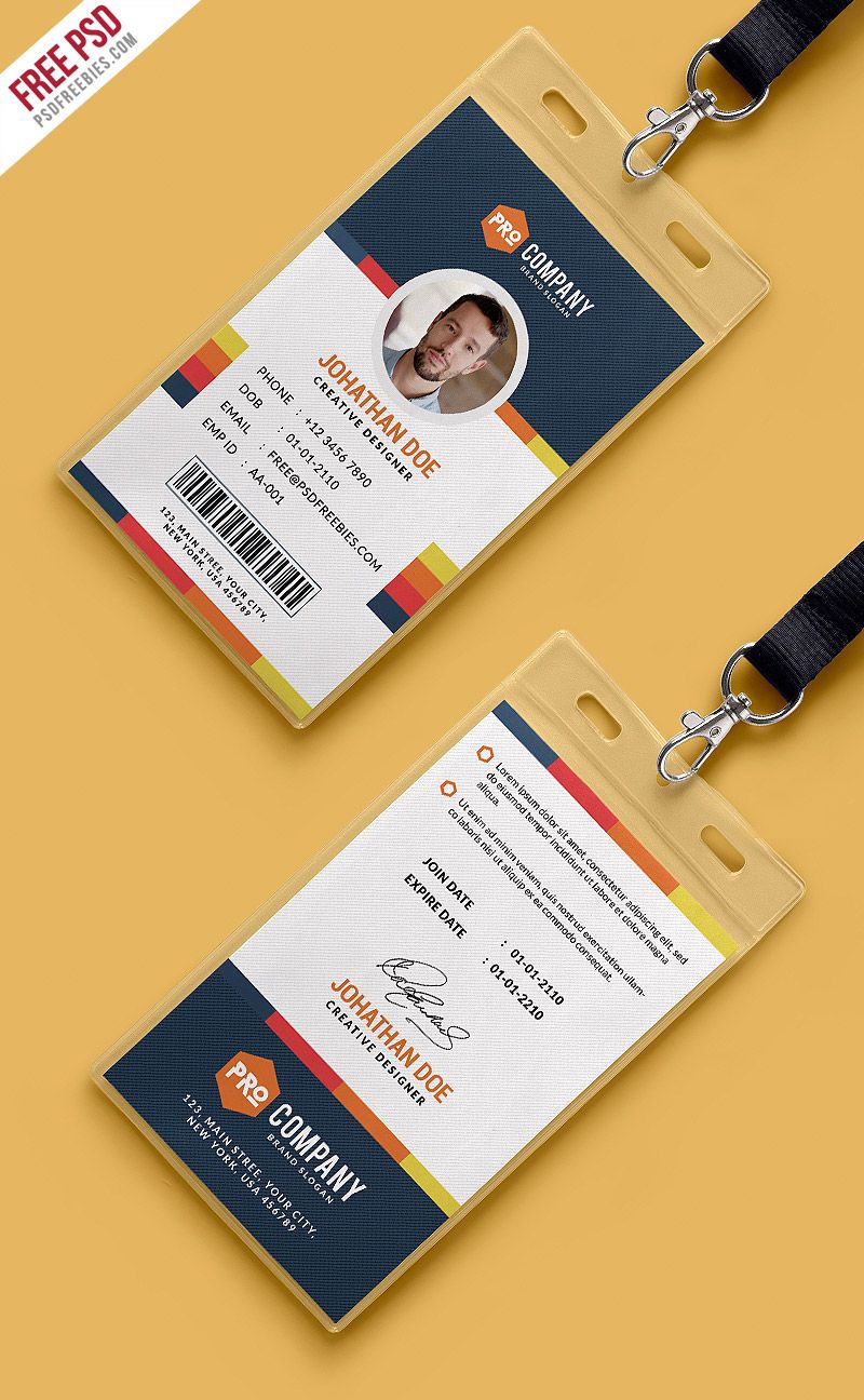
New Cards, New Conversations
Your business card is one of the smallest but most powerful tools in your branding toolbox. It fits in your palm, but it can spark big conversations. When you’re rebranding, updating your business card is like handing someone your updated story—one they can keep.
Imagine giving someone a fresh card with a new design, modern fonts, updated contact details, and a refined logo. They’ll instantly notice the change, and most times, they’ll ask about it. That’s your opening to explain the new direction of your business and how you’re growing.
A good prints service can help you choose the right paper texture, shape, and color style to match your new vibe. Rounded corners? Bold colors? Matte finish? Yes, yes, and yes. It’s your mini billboard—so make it count.
Banners That Broadcast Your Brand’s Glow-Up
Banners don’t whisper—they shout. They’re perfect for making big statements, especially when you’re launching your rebrand. Whether you’re at a trade show, hosting a company event, or simply refreshing your storefront, a new banner is a bold way to say: “We’ve changed for the better.”
Rebranded banners give your space an updated energy. You can include your new tagline, colors, or even highlight your core values in a visually exciting way. Think of it as a moving billboard that gets noticed, even in a sea of distractions.
Working with a trusted prints service gives you access to high-resolution printing, vibrant colors, and durable materials that hold up indoors or outdoors. After all, when you’re reintroducing your brand, the last thing you want is a droopy, faded banner that looks like it came from the last decade.
Printed Materials Keep Everyone on the Same Page
Rebranding isn’t just about public appearance—it’s also about internal alignment. When your entire team is walking around with the same new business cards, handing out the same updated flyers, and displaying the same branded banners, it creates a sense of unity.
Whether you’ve got five employees or fifty, printed materials can make your brand feel more “real” to the people behind the scenes. They’re holding the new identity in their hands. It’s no longer just a file on the design team’s laptop—it’s printed proof that your brand is entering a new era.
And when your clients or partners notice this consistency, they’ll respect the effort. It tells them your brand pays attention to detail and takes pride in presentation.
Why Rebranding Deserves Print Love
Sure, digital updates matter—your website, your social media profiles, your email templates. But don’t underestimate the value of physical branding. In a world full of screens, holding something tangible—like a beautifully printed flyer or brochure—feels refreshing and memorable.
Printed materials have staying power. That rebranded card might live in someone’s wallet for months. That brochure might sit on a desk, catching someone’s eye every day. That banner might be the reason a customer walks over and asks what’s new.
When you use a reliable prints service, you’re not just getting ink and paper. You’re getting quality, guidance, and a product that reflects who you are now—not who you used to be.
Final Thoughts: Fresh Prints, Fresh Vibes
Rebranding can feel overwhelming, but it doesn’t have to be stressful. Think of it as your brand’s glow-up moment—a chance to show off your new style and direction. And there’s no better way to showcase it than with professionally printed materials that do the talking for you.
So go ahead—update those cards, refresh that flyer, roll out that banner, and step confidently into your next chapter. Your prints aren’t just tools—they’re messengers of change.
And with the right prints service behind you, your rebrand won’t just look good. It’ll feel right.
Let’s be honest—you care about your business and the planet. The good news is that you don’t have to choose between the two. Thanks to smarter printing practices and better materials, you can create eye-catching marketing prints without harming the environment. It’s a win for your brand and the Earth.
You might be thinking: “Is it even possible to go green without going bland?” The answer is a big, leafy yes! Sustainable choices can still deliver bright colors, clean finishes, and all the professional vibes your brand needs. And with the right prints service, you’ll find eco options that work just as well as traditional ones—if not better.
Let’s explore how your print decisions can support the planet, strengthen your brand, and show your audience you care about more than profits.
Paper With a Conscience
Not all paper is created equal. When choosing what to print on, you’ve got eco-friendly options that still look and feel premium. Recycled paper, for instance, has come a long way from the dull, gray stuff you might remember from school projects.
Modern recycled papers are crisp, clean, and available in different finishes—matte, glossy, textured—you name it. They can easily hold vivid colors, sharp graphics, and bold fonts. So if you’re using a prints service, don’t hesitate to ask about their recycled stock.
There’s also FSC-certified paper, which comes from responsibly managed forests. It basically means the trees used to make the paper are replaced, protected, or replanted. If your brand values sustainability, FSC logos on your materials send a great message without saying a word.
Inks That Don’t Cost the Earth
You might not think twice about ink, but it’s a big part of eco-friendly printing. Traditional inks are often petroleum-based, which isn’t great for the environment. Thankfully, you’ve got greener options—like soy-based or vegetable-based inks.
These alternative inks produce fewer volatile organic compounds (VOCs), which makes the printing process safer and cleaner. Plus, they offer beautiful, rich colors that hold up just as well as regular ink. You’ll still get stunning business cards, brochures, and flyers, just with less environmental baggage.
When choosing your prints service, ask if they offer low-VOC or plant-based inks. It’s a small switch that makes a big impact.
Designs That Reduce Waste
Good design doesn’t just look nice—it saves paper, ink, and money. By working with a skilled designer (or thoughtful prints service), you can create layouts that maximize space and minimize waste.
For example, sticking to standard sizes helps avoid paper trimming and offcuts. Using double-sided prints cuts down on the number of pages. And printing in batches means you’re not reordering every week, which reduces carbon emissions and packaging waste.
You can also go digital-first for some materials—like event invites or newsletters—and save print for the pieces that really count, like banners, signs, or high-impact brochures. It’s all about finding a balance that works for your brand and the planet.
Show Your Green Side Loud and Proud
Being eco-conscious is something to celebrate, so don’t hide it. If your printed materials are made with recycled paper or eco-ink, say so! Add a small badge, symbol, or line of text that lets people know.
It’s not bragging—it’s brand alignment. Your customers will see that you walk the talk when it comes to environmental responsibility. In fact, many consumers are more likely to support businesses that care about sustainability. It builds trust, shows leadership, and adds a modern touch to your message.
And guess what? It also makes your materials stand out. An eco message on the back of your business card? That’s memorable. A flyer printed on natural paper with a small “printed responsibly” note? That sticks with people.
Final Thoughts: Printing Smarter Is the New Cool
You don’t have to sacrifice quality, beauty, or creativity to print responsibly. Eco-friendly choices are now stylish, effective, and surprisingly affordable. With the right prints service, you can create marketing materials that support your brand image and protect the environment.
So whether you’re printing brochures, banners, notebooks, or posters, go ahead and take the green route. The trees will thank you, your customers will admire you, and your brand will feel a whole lot fresher.
Your next print run could be your most meaningful yet—because looking good and doing good is always in style.